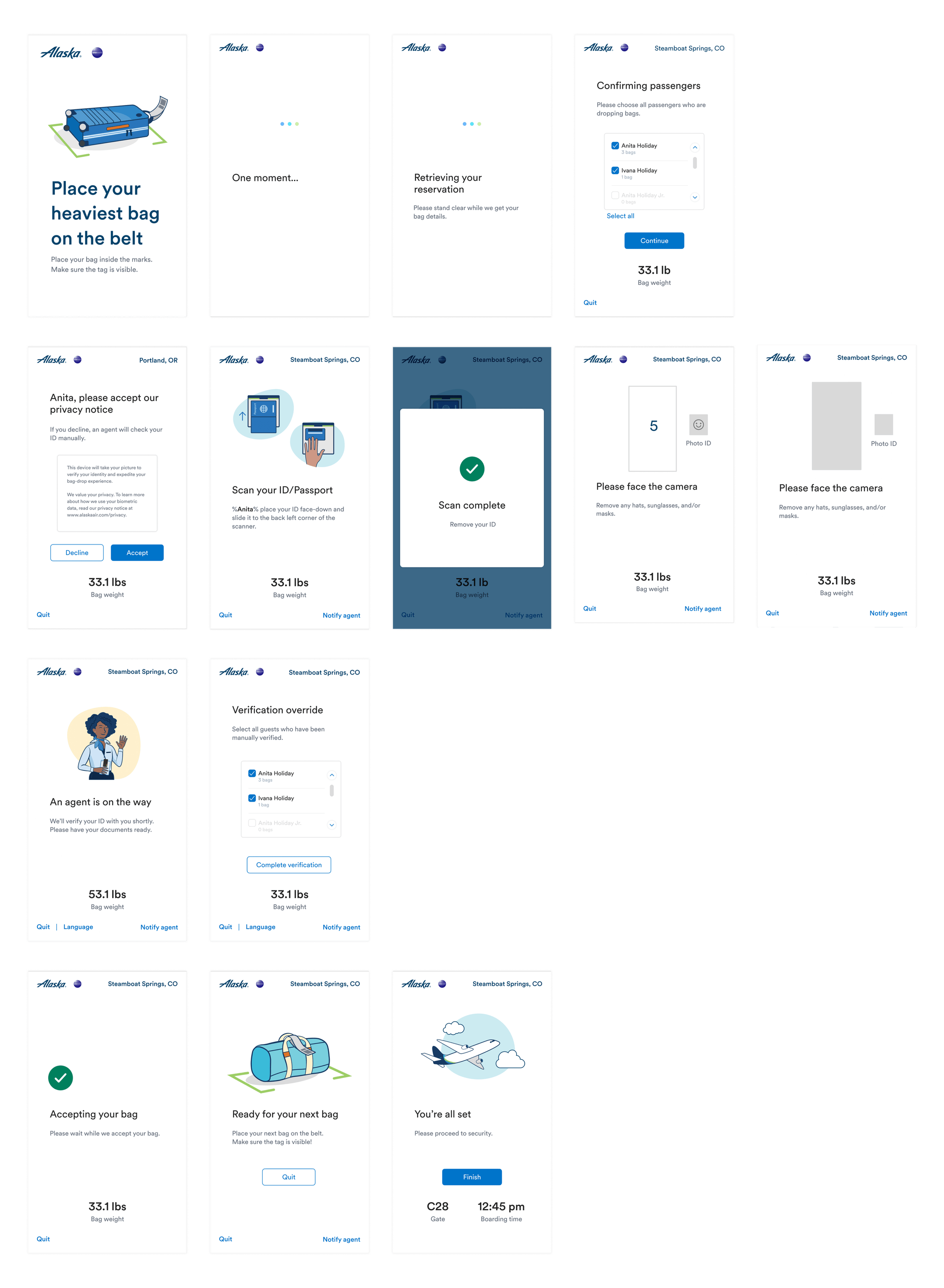
Reimagining Bag Drop
Project Name: Automated Bag Drop Experience (ABD)
Role: Lead UI/Product Designer
Team: Vendors, UI & Product designers, UX writer, illustrator, UX researchers, product managers
Timeline: ~6 months
1-liner Summary: Designed and launched a branded and accessible self-service bag drop experience in busy airport lobbies.

Photo credit: Alaska Airlines

Problem
Airport lobbies must handle increasing guest volume.
Kiosks helped, but full bag drop automation will help reduce lines and agent load.
Guests are often stressed, so behavior change must be intuitive and supportive.
Users & Context
Travelers checking bags in a lobby setting
Accessibility needs (vision impaired, wheelchair users)
Stressful, high-traffic airport environment
Limited time and attention from users
My role
Led UI design and collaborated across teams in Figam & Figjam, partnered with an illustrator to develop a custom graphic system, contributed to user-testing and observations, created core flows and visuals within white-label system constraints, developed design systems for adaptive experiences, worked directly with the vendor, and presented in stakeholder reviews. Promoted during the project to lead product designer during phase 4.

Developing visual language
Since the workflows are complex and variable, and largely a new experience, typical photographic imagery was not an option.
To ensure the graphics could be interpreted correctly, we conducted a study to see if participants could place their bags on the conveyor belt using different text and illustration combinations. This provided insight for refining our illustrations and feedback for adjusting the copy.
Learnings include
The angle effectively demonstrates bag placement on the belt.
Markings assist travelers in locating where to place their bags.
The text clearly outlines how to orient a bag.
Phase 1: Understand the existing system
Heuristic audit of vendor UI
Accessibility gap analysis (DOT/ADA standards)
Stakeholder share-out for buy-in
Reviewed Alaska brand and kiosk consistency


Phase 2: Initial build
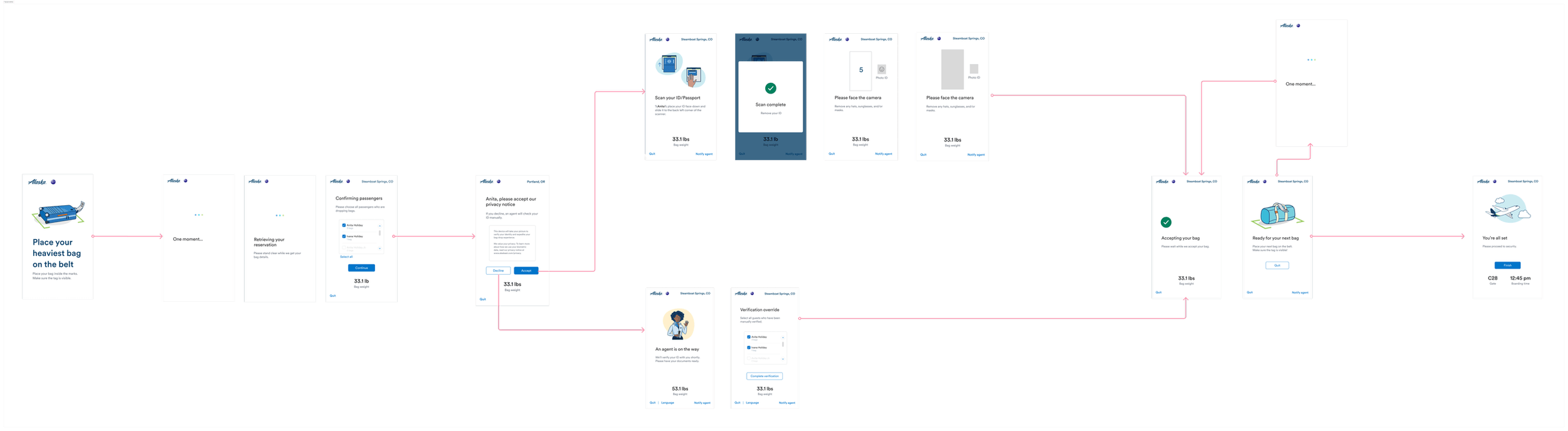
Customized session flow (e.g., bag-initiated check-in)
Simplified group check-in
Designed error states by category (reservation, hardware, ID, etc.)
Updated light and projection systems to align with UI
Define visual styling and templization
Phase 3: Testing & iterating
Accessibility testing (vision, mobility, cognitive)
Lab usability testing (2 rounds)
In-airport testing (PDX)
Partnered with signage team for cohesive wayfinding


Results:
Launched ABD experience at PDX (Aug 2024) and SEA (Nov 2024)
Travelers could complete bag drop in under 1 minute
Positive feedback from travelers and agents
Initiated Phase 4 based on live data insights and error patterns
You can only design for what you know. Real-world use revealed a deeper connection between digital design and existing baggage systems. We’re now addressing ecosystem-wide problems and planning proactive guest education for the next phase.