
Adding interaction
and a whole new kiosk

Photo credit: Alaska Airlines
As part of a multi-year effort to transform the airport lobby, we reimagined how guests navigate and behave in this space; designing an experience that helps manage growing passenger volume with greater efficiency and ease.
This project focuses on redesigning the attract screen for the bag tag printer to encourage proper guest behavior, increase throughput, and align with brand and accessibility requirements. The release of this project aligned with the launch of the new sleek bag tag printer design, replacing older, bulkier kiosks.
Role: UI/Interactive Designer
Platform: Physical kiosk attract screen
Team: Product managers, UX writer, stakeholders
Timeline: 2 months
Original design

Wireframe

Problem/Opportunity
Guests often tapped the screen instead of scanning their boarding pass.
Needed to guide guests quickly and clearly in a stressful, fast-moving environment.
Confusion around boarding pass scan, check-in status, and language accessibility was causing slowdowns.
Goals
Reduce tap-to-start behavior and encourage scan-to-start
Ensure clarity of instructions at 4-5 feet away
Support accessibility and compliance requirements (FAA, WCAG, ACAA, ATPDR)
Speed up lobby throughput by reducing confusion at entry point
Users & Context
Airport guests checking bags via kiosk
High-stress, high-traffic environment
Multilingual and accessibility needs (vision impaired, mobility limited)
Shift to using digital boarding pass, most commonly on traveler’s phone.
but could also scan anything with the boarding pass QR code (paper, watch, etc)
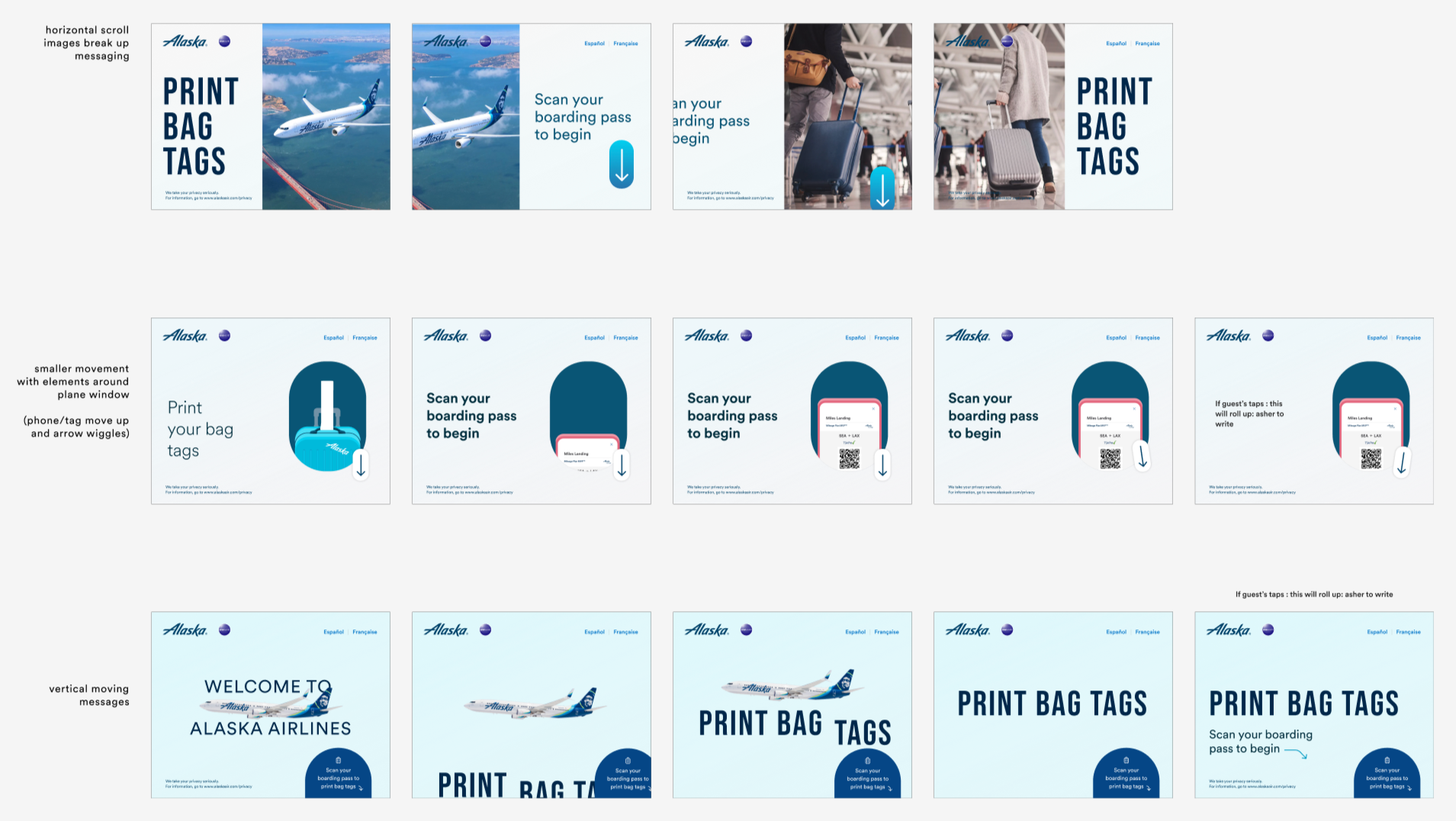
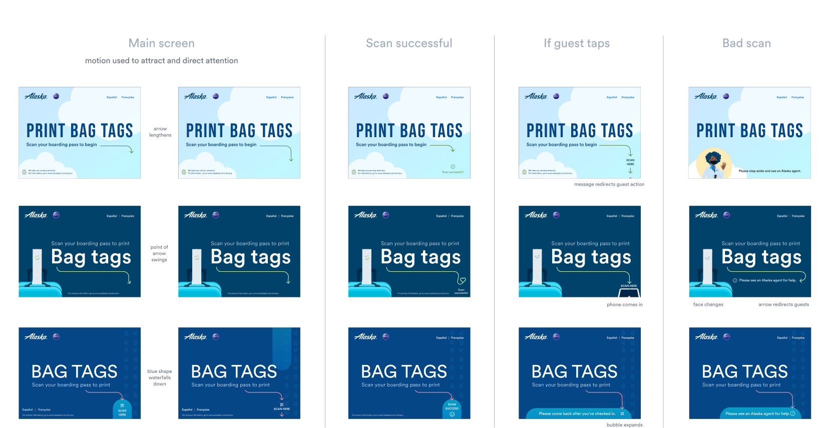
Design Iteration
Created multiple visual concepts emphasizing scan behavior
Adjusted character height for 5-ft legibility
Studied airport environmental lighting effects on screen color
Competitive analysis of other airline kiosk attract screens
User tested using motion (flashing) to see if we could direct guests to the correct spot
Developed multilingual buttons and language selector UI
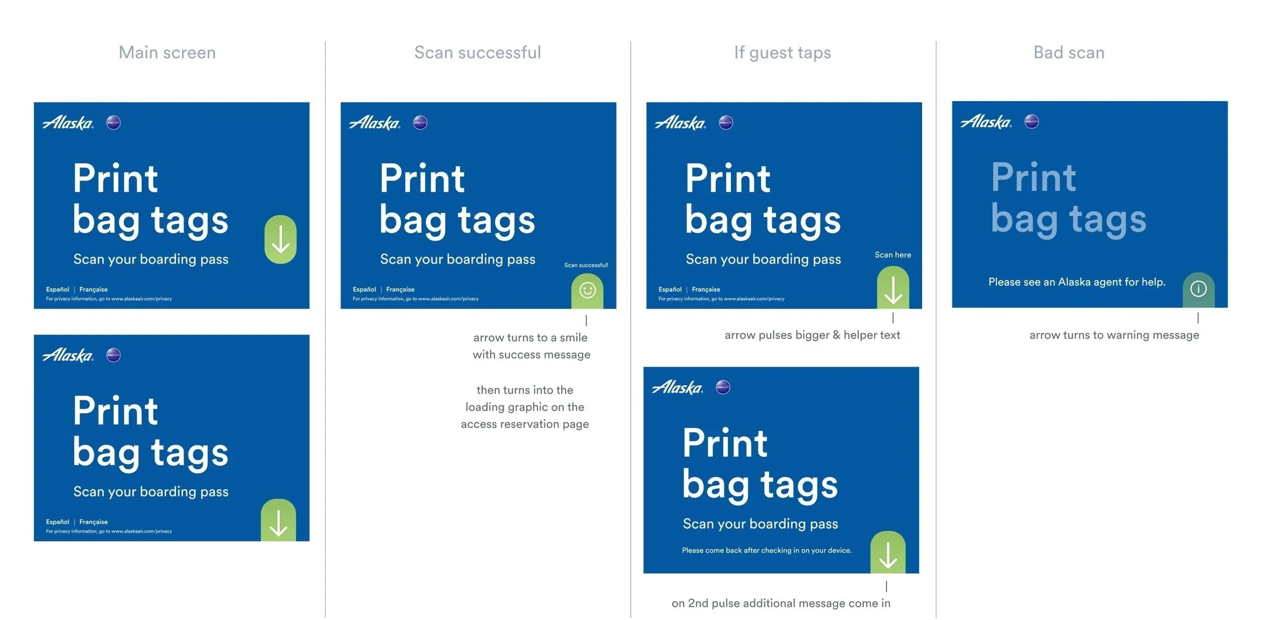
Designed scan animation and tap feedback animation (subtle, clear)
Integrated branding elements consistent with app and other lobby stations
Final design
Determined motion was the key to meeting many of the project goals.
Interactive design iterations.

Result
The final developed attract screen increased scan-first behavior through visual and motion cues.
Consistent with brand and lobby experience
Launch aligned with broader lobby upgrade initiative and brought joy to the experience
Proven to successfully function in accessibility tests and in 7 languages (currently).
Successfully increased desired customer behavior, despite a learning curve with the scanning device. 4% improvement in initial tests, which increased over time.
Redesigning the attract screen highlighted how subtle details—such as animation, color, and word choice—can significantly influence guest behavior.
As a follow-up, we improved the tab behavior to redirect guests to the correct scan-first process with mixed results, largely due to challenges around reading comprehension in stressful, busy environments.
Working with a developer who shared my enthusiasm for experimentation and pushing boundaries was essential to bringing the design vision to life as intended.