Travel Experience
Lobby Vision
Reimagining the Experience
Alaska Airlines
Designed self-service ecosystem at Alaska Airlines, from checking in on the mobile app to bag drop machines to digital signage, as the airline grew from domestic to international, merged with Hawaiian, and expanded to 9+ languages.
My role evolved as my focus shifted from shipping features to solving a harder problem: changing guest behavior in one of the most stressful environments in the world.
-
UI Designer → Lead Product Designer
Role
-
2022–present
Timeframe
-
Millions of passengers
Scale
-
>5 min throughput
Overarching Goal
A multi-year, multi-touchpoint systemRedesigning the lobby experience

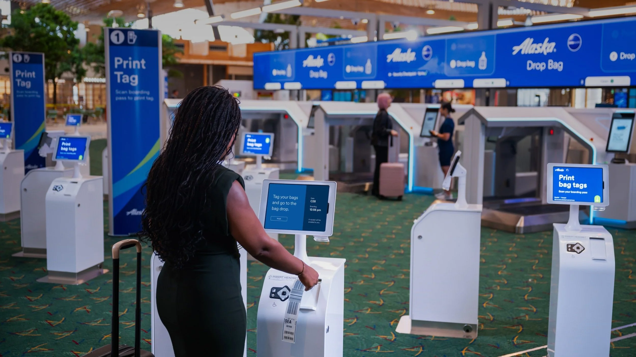
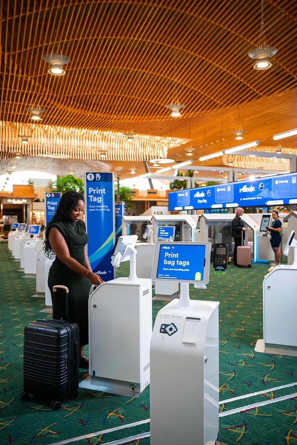
2025 launch of bag drops machines (photo credit: Alaska Airlines)
Airports are one of the highest-stakes design environments that exist. Millions of passengers, extreme stress, accessibility requirements, physical and digital systems that have to work in concert. I’ve worked across the full Alaska Airlines lobby experience, from the moment a guest walks through the door to the moment their bag disappears down the belt and they head towards TSA.
When I started on the lobby team, the work looked like standard digital product work: design the kiosk UI, ship the flow, move on. But working in real airports, watching real passengers interact with these machines, revealed something that never shows up in analytics: guests weren't failing because the interface was bad. They were failing because they didn't know what to do before they got there, and they were stressed.
I came to see guest education as one important piece to solve problems in airport self-service experience. A guest who approaches the bag drop machine for the first time is in a fundamentally different situation from one who has successfully used one before.
2022 trial of early design phase around when I started on the project (photo credit: Alaska Airlines)

2023 testing in PSP (photo credit: Alaska Airlines)
Work across the lobby — five chapters
-
Check-in — from kiosk to mobile app and web
As check-in shifted from physical kiosks to the Alaska app and web experience, a mobile boarding pass became the key to the touchless lobby concepts. I worked across the transition and platforms. This work required designing consistently across physical and digital surfaces so the lobby experience felt coherent regardless of where a guest started.
-
Bag tag kiosk attract screen — using motion to shift scan-first behavior
Redesigned the attract screen for Alaska's new-generation bag tag printers, using tested animation to redirect guests from tapping to scanning. Solved for legibility at 5 feet, multilingual UI, and FAA/WCAG/ACAA accessibility standards.
-
Automated bag drop — a new self-service behavior, launched at PDX and SEA
Led UI design across four phases, from vendor audit through in-airport testing at PDX and live launch at two airports. Developed a custom illustration system to teach bag placement without relying on photography. Promoted to lead product designer during Phase 4.
-
Digital and print signage — wayfinding concepts tested in lab and airport
Contributed to signage concepts for lobby wayfinding and gate areas, including testing sessions in the lab and in-airport at PDX, SEA, and SFO. The work fed into the broader lobby strategy even though final production was handed off. Each airport had distinct physical constraints that shaped the design approach differently.
-
Gate signage and TSA biometrics — designing for the next phase of the lobby
Contributed to gate signage concepts and early work on incorporating TSA biometric integration into the passenger flow. This work sits within a lobby future vision — thinking about where the experience needs to be, not just where it is.
Testing across six airports revealed what the lab couldn't
-
SEA
Seattle, WA
Second major deployment Nov 2024. Higher volume, more complex lobby layout, different passenger mix. Scale stress-test. Constant construction.
-
SFO
San Francisco, CA
Launch of the full experience 2024. High-volume, tech-forward passenger base. Different self-service expectations and common-use devices.
-
HNL
Honolulu, HI
Post-merger integration. Hawaiian Airlines brand reconciliation. High international + tourist traveler proportion. Additional language and accessibility profile.
-
PDX
Portland, OR
Primary deployment and test environment. First live bag drop launch Aug 2024. Familiar passenger base, strong baseline data.
-
LAX
Los Angeles, CA
Large, complex terminal environment. More international travelers. 2025 payment device and international document test environment.
-
PSP
Palm Springs, CA
Smaller market, different traveler profile. Useful contrast case for self-service scales from hub airports. Unique baggage needs and passenger mix.
“You can only design for what you know. Real-world use revealed a deeper connection between digital design and existing physical systems than any amount of lab testing could have prepared us for.”
— Reflection after PDX launch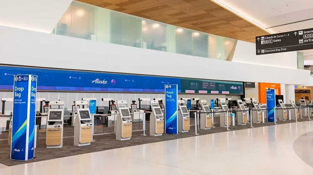
2015 SFO lobby | Customized for a fully CUSS experience (photo credit: Alaska Airlines)
Alaska + Hawaiian
Merger integration and internationalisation
The Alaska–Hawaiian merger meant integrating two brand identities (which somehow turned into 4 brand identities with the lanuch of Atmos), more sets of airport environments, and two traveler cultures — all while continuing to ship. It also meant that now Alaska was an international airline so translating the lobby experience into 9+ languages became a big peice of the the design work I lead within the lobby space to intergrate as HA experience.
Instructions that fit comfortably in English often required fundamental restructuring in other languages without losing the glanceability that the kiosk environment demands. Language length variability was a design constraint baked into every component.
What this taught me about designing for language is that every layout decision has to be made with the longest likely string in mind. And in an airport environment where legibility at distance matters, a 40% longer string isn't just a formatting problem — it's a comprehension problem.
Passenger journey — touchpoints I worked on
PRE-AIRPORTManage reservation
(web & mobile app)
WAYFINDINGDigital signageLive ActivityApple Watch AppBAG TAGProprietary bag tag printer
CUSS kiosk
Bag tag print flow
BAG DROPAutomate bag dropsIllustration systemSECURITYTouchless IDDesign Concepts & Testing Full Design Owner & ShippedCheck-in flow (web & mobile app)
(photo credit: Alaska Airlines)
Insight
Guest education is a business requirement
The insight that shaped the last year of this work: the biggest friction in self-service adoption isn't the machine interface. It's that guests arrive at the machine having never encountered it before, in a high-stress environment, with no preparation. The most carefully designed kiosk UI in the world will never fully compensate for a guest who doesn't know what they're about to do.
I built and presented the case to leadership that proactive guest education — through the app, through pre-trip communications, through the check-in flow itself — is a business requirement, not a nice-to-have. The data supported it: error rates, agent intervention rates, and throughput metrics all improved when guests arrived prepared.
Guest education helps show the process to travelers and leadership as a fluid system. You can't see that effect if you're designing features. You can only see it if you're designing a system.
Bag tag attract screen
4% increase in scan first behavior
Redesign the attract screen on the bag tag printers, using motion, lead to a change in guest behavior and increasing lobby throughput.
Automated bag drop flow
1 min completion rate
Designed Alaska Airlines’ first accessible, self‑service bag drop—simplifying complex airport workflows and reducing traveler stress.
Multi-brand lobby
4 brand experiences. 9 languages. 5 different setups.
From single-brand hardcode to a themeable, scalable system for 4 distinct experiences.
See this as a system changed how I approach every design problem involved. I come to new work asking different questions — not just what this screen needs to do, but what the person using it just came from, and where they're going next. Not just whether this feature works, but what it assumes about everything upstream, and what it sets up downstream.
That's the thing ecosystem thinking gives you that feature thinking can't: a view of the whole journey, and the humility to know that no single touchpoint is ever really the problem — or the solution.
Successes: